Introduction

Saturday, 16 March 2013

Part 2 - Elements of Design - Exercise 8 - Rhythm and Pattern

The final exercise in Part 2 was Rhythm & Patterns, where I had to produce 2 photography one conveying rhythm and the other a pattern.


Rhythm
For rhythm I shot a large pebble by the shore of a river when the water was low. I used a shallow depth of field to concentrate the initial focus on the stone and let the eye travel across the sand to the rhythmical beat of the absent flowing water that has left the rolling waves of sand. I decided on a tight square crop to contain the feeling of motion and not fade out of the image, instead allowing the eye to bounce off the edge of the frame and travel back across the mini sand dunes.


Pattern
This image was taken of a pile of old railway bolts. I found the colours and the random directions created an interesting pattern when cropped tightly to show no edges to the pile. I was aware that strictly speaking pattern should be spatial repetition and this image is possibly too random in the spatiality of the bolts and sending the eye in lots of different directions. Although I felt that with the tight crop and no boundaries I can still be that the eye imagines them continuing well beyond it.

Pattern 2
Pattern 2 has been added to give an example of a more traditional pattern with these bolts on the side of a rail wagon where with low sunlight have long low shadows to give a more 3 dimensional feel to the bolts. The strong horizontal and vertical lines made by the bolt heads cement a static feeling, but with the even spaces between them and the tight crop it can be imagined that out with the boundaries of the frame they will continue to produce this static pattern.


Friday, 15 March 2013

Part 2 - Elements of Design - Exercise 6 - Implied Lines

First up for this exercise was to looking at the following 2 photographs and if a dominant implied line of direction was found then mark it with an arrow.

Corrida by Michael Freeman
This image by Michael Freeman captures the graceful movement of a Matador and Bull. I found that there was a strong line of direction clockwise around the Matador which the bull is going in. This notion is heightened by the red circular line in the dirt and the whole picture gives us a feeling of spinning almost like a tornado around the Matador.

Threshing Corn in Sicily by Gotthard Schuh

Gotthard Schuhs' image again captures great elegant movement of the 2 horses as they trot around their trainer. There is a definite circular motion going anti clockwise around the man where with the horses heads pointing in the same direction only reinforces this. There seems to be less strong implied lines between the man and the horses along the rope connecting them and the eye line of the man. These lines seem to give a feeling of togetherness joining the 3 into one graceful movement. I also feel I can imagine the up and down motion of the horses trot perhaps due to there stride seemingly being captured in unison.

The second part of the exercise was to choose any 3 photographs and perform the same analysis as with the first 2.

Image 1

Image 1 was taken on a cold winters afternoon with a kite surfer braving the conditions. Generally we have the horizontals of the horizon and the sea waves with very little happening above the horizon. There is some directional lines along the waves suggesting the surfers direction of travel is from left to right. But with the physical line between the surfer and his kite we get a stronger implied line which allows us to drift our eye up from the sea and into the grey mirky sky and onto the kite, bringing more of the image together.

Image 2

Here in image 2, we get the strong implied line from the subjects eyes to the writing on the sand. Her direction of travel also gives a sense of movement around the heart shape instead of just standing looking at it. There is also a line along the beach/grass line that leads us to the subjects eyes that we subsequently travel down her eye line to the sand with an almost zig zag effect.

Image 3

In image 3 we have 3 subjects, initially we have the young girl walking alone the line of her shadow with arms out, giving the implied line out of the image. We also get a sense of movement from the 2 ladies on the left, with the wind obviously blowing their hair and dresses from behind there is almost a feeling they are unable to resist its strength and are being blown out the shot from right to left, the opposite of the your girls direction of travel. The complete image gives me the impression of someone putting their hands into the centre of the image and parting them outwards, trying to wipe the 3 subjects from the shot.

The 3rd part of this exercise is to take 2 photographs planning implied lines to lead the eye using firstly, eye line then the extension of a line or lines that point.


Image 4 - Eye-line
Image 4 was my attempt to capture an image that used implied eye-lines to lead the eye. These faces hang in one of the huge rooms of the Kelvingrove Museum, Glasgow and I used their totally random direction to create an almost haphazard image where the eye is lead in all different directions around the many faces to a point of almost confusion. Possibly not the most stable image but for this exercise I thought it would highlight the impact of implied eye-lines as tools to direct and lead the eye. I cropped to a square to try and highlight the confusion where as with the original portrait crop I found there was an opportunity for the eye to escape from the madness that was intended.


Image 5 - Extension of a line, a line that points
Here in image 5, I was messing around with depth of field, moving my focal point with the aperture wide open to see what I got as I looked along some barbed wire. I noticed that by moving my viewpoint and focusing in on this certain piece of wire I could use the top point of the 3 strands around the wire to point the eye down the line of the wire and into the blurred abyss created by the shallow depth of field. This time I used the portrait crop to help emphasise the nothingness that lay along the wire.

It was enlightening to realise the importance of implied lines when working through this exercise. Again this might have been an unconscious decision when framing an image before hand but now hope to put more thought into my design of a shot and where I want to direct the viewer and hold their attention in a certain part of the image. And it has also helped me understand why some images grab my attention and give a certain feeling or mood when being explored.

Friday, 8 March 2013

Part 2 - Elements of Design - Exercise 5 - Curves

This exercise was similar to diagonals, where I had to go out and take 4 image thats use curves to emphasise movement and direction.

Image 1
My first image was taken of a hand railing overlooking a river. The strong curve takes our eye around the image in a shallow loop starting at the front. I used a shallow depth of field to continue with the flatness and keep the start point of the eyes journey sharp giving no alternate to the viewer but to start at the front and work around the rail.

Image 2

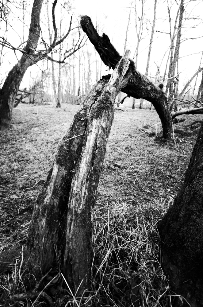
In image 2 I was in a very tranquil wooded area and wondered how I could bring some suggestion of movement and direction to a shot. When I found this strangely bent tree I adjusted my view point and used a wide angle lens at 14mm to accentuate the natural curve and create the feeling of movement along and round its shape, bringing some life to an otherwise dormant, still location.

Image 3

Image 3 was taken in a shopping wall I had photographed before and new there was the winding staircase. I selected a section to shoot and tried to use both rails to portray some smoothness and grace as they climbed up the curvature of the stairs themselves. The twist in the stairs also gives me a feeling of the eye being pushed across from the right rail the left as we come to the top of the stairs then almost bringing the eye back down again.

Image 4

With image 4 I used a modern footbridge across the river Clyde in Glasgow, facing the financial district of the city. Here we have the very strong curves of the bridge winding and twisting across the shot from left to right. The rail also adds to the sense of movement and helps direct the eye across the bridge as with its perspective it points us in that direction. By moving my viewpoint and getting lower than eye level I managed to get the far end of the bridge tuck under itself and complete the full journey across, whereas with other attempts in a higher viewpoint this was hidden by itself and left it looking as if it stopped midway across.

This exercise along with the previous 3 had me looking at things I had always looked at and see more of them. These curved, horizontal, vertical and diagonal lines were always there but it is only after examining them and looking out for them that I realise their effect and emphasis on an image are huge. Possibly this was a subconscious part of my photography before but now having the conscious understanding of their importance I hope to try and produce more interesting images that I have deliberately designed to be viewed in a desired may, that is appealing to the viewer.


Thursday, 7 March 2013

Part 2 - Elements of Design - Exercise 4 - Diagonals

In this exercise I had to take 4 photographs that use diagonals strongly.
With only a few real diagonals available, viewpoint and perspective can be used to create diagonals.

Image 1

Here in image 1 I found some real diagonals, unsurprisingly being stairs. There is not one simple diagonal in this shot but 4 with 1 being in a complete opposite direction to the other 3. In this setup I find that the stairs create movement within the image, taking the eye up and around the image as we natural walk our eyes along the stairs from ground up. I converted to B&W to highlight the linear nature of the stairs.

Image 2

In image 2 I used a natural slope and shadow of a mountain when visiting the Cairngorms. I used a square crop, the horizontal of the horizon and vertical of the post to emphasise the dissecting nature of the diagonal which cuts through the clouds and takes our eye down along the slope. Again this is more of a real diagonal rather than one created by viewpoint or perspective and suggest a feeling of speed as we imagine traveling done the slope. I kept the blues prominent to emphasise the cold and the clearness of the sky.


Image 3
For image 3 I used perspective and viewpoint to create the the strong diagonals of the straight path that leads to an derelict bowling club in Glasgow's South side. By going down low and centring my position I manage to create 2 strong diagonals that draw the eye in towards the boarded up buildings. The converging lines are very useful to direct the viewer into this picture. The B&W conversion was used to continue the feeling on dilapidation. 

Image 4

Image 4 used perspective to create the strong diagonal. This is a footbridge across the river Clyde and there is a real feeling of movement as the diagonal line of the barrier and shadows takes us across the bridge an into the buildings on the other side. The diagonal of the suspension support also takes us to the same point converging with the lines of barrier. 


Concluding, I found diagonals are very useful in creating an image and instrumental in directing the viewer as well as giving the feeling of movement or direction. The fact that they can also be easily created by changing viewpoint or focal length means they are something that should always be in a photographers mind when composing an image.

Thursday, 28 February 2013

Part 2 - Elements of Design - Exercise 3 - Horizontal & Vertical Lines

In this exercise I had to go out and photography examples of vertical and horizontal lines which tend to induce feelings of stability in an image.
The aim is to find some of the different ways vertical and horizontal lines appear to the eye and camera.
Firstly I will show and discuss 4 vertical examples then 4 horizontal.

Verticals

Vertical 1
I used the wooden slats of a small fence for my first vertical example. A fence in itself tends to suggest stability and with the vertical shoots of grass from the top of the wall giving a secure base to the longer wooden slats, I feel the whole image gives a very sense of strength and stability. It was a winters morning and so kept the vibrance low to highlight the sparse growth of the grass. The clear blue sky was used to contrast the busy vertical slats.

Vertical 2
Here I used the vertical lines of the path which continue up through the image with the lamppost continuing the vertical stability of the image. I kept the lines running through the middle of the image to try and help stabilise the image and feel with the horizon and side walls there is almost a suggestion on a standing cross in the centre of the image which splits the scene almost equally into 4 quarters. I feel this creates a steady image with a strong vertical line that emphasises to the viewer immediately.

Vertical 3
In vertical 3 I tried to use one single strong vertical line in an otherwise haphazard surrounding. I used a small aperture to get a slower shutter speed, this was primarily to show the motion of the blowing grass on the sand dune. Although this also allowed sharper focus of the more static grass at the front/bottom of the image while the main focus was on the sign post and sign. The rigidity of the pole in all the confusion of the wind swept grass gives a feeling of strict order, this is then supported with the written warning of the sign itself which I feel gives the whole image a feeling of freedom that as you explore the image more is quickly brought back into check by the strength of the vertical signpost which then leads to the sign warning itself. I then find that the eye again wanders back into the image only to repeat the whole freedom/order contrast all over again.

Vertical 4
Vertical 4 has an immediate feeling of strength with another centrally positioned vertical. This time I feel the lines (the fence posts) aren't quite so strong themselves but that it's the vertical lift of the stairs that create the strong line. Cutting through the image equally also gives that feeling of static and the natural vertical growth of the grass also heightens the vertical concept giving the whole image a strong visual direction from bottom to top. Again the low vibrancy was used to give the feeling of the cold winter morning and allowing the darker vertical steps to be the main point of interest.


Horizontals

Horizontal 1
Here I used another set of steps but tried to highlight the horizontal strength by using the strong shadows they create. I used a flat horizontal crop to help support the lines. I feel that my eye climbs the steps, going along each one then once at the top it wanders out across the top of the lawn which acts as a strong horizon throughout the whole image. The chimneys in the background are a slight contrast to the strong lines but stick with the overall line of travel by running along the same horizontal as the rest of the image. The low vibrance was used to emphasise the strong black shadows of the steps.

Horizontal 2
In this 2nd image I used the horizontal lines of the black seaside bench against the more erratic stone wall. The wall has its own rigid straight horizontal that I feel is only strengthened by the bench and the long shadows created with the low winter sun. I also see this image as 3 horizontal strips all sitting on each other, the path, wall and bench and the strip of short grass on top, I suppose think a sandwich. But the main thing for me is the bench (being somewhere to sit), that looks as if it sits securely on the path and is thus implies a safe secure place to rest.

Horizontal 3
This image shows many strong horizontal lines, from the sky, to sea, to shore, to beach, to wall then onto the path, even the clouds are in a static horizontal position with only the small drainage circular whole as a useful contrast. The panoramic crop is also intentionally there to heighten the strong lines. The dark wall is the main line with the others feeling as though they are running along with it. This feels to me to be more of a design than an image to explore, with the shades and colours being the main intrigue.

Horizontal 4
With horizontal 4 tried to play with the same design concept of horizontal 3 but with more of a contrast and interest for the viewer. The sky, horizon, beach and crop are similar but this time I used the man pushing his trailer along the beach as a vertical contrast along with the few sprouts of grass to hopefully create more interest. I experimented by placing the man on the right of the shot instead of the usual left that generally draws the eye across the image looking at where he is going. I placed him here to try and give the impression that he has just walked along the long horizontal line of the beach. I'm not too sure it works as I am feeling he does tend to draw my eye to him and in doing so alienating the left hand side of the image. I turned the clarity way down on this to try and create a smooth pastel sky and sea which in turn would hopefully give a more safe static feel as this was taken in quite wild conditions.


So this is my attempt at exercise 3 where I have taken 8 images showing horizontal and vertical lines that in turn generally give a sense of stability. It is only in studying these images and making my selections that I have managed to get the real feeling that each line gives and how strong horizontals and verticals can have an impact on an image.


Thursday, 7 February 2013

Part 2 - Elements of Design - Exercise 2 - Multiple Points

The exercise required the set up of a still-life to show the implication of lines and shapes created by the positioning of objects. To link them attractively in a relationship that is active rather than obvious and static.

The following set of photographs show each addition to the still-life step by step with a note below giving my thought when doing so and what I felt it did to enhance the final composition. All the images were taken with the camera fixed to a tripod and using 1 strobe light from the left of camera.


Image 1
This was my starting background. A grainy piece of loft flooring with a circular saw sitting just on the top edge of the shot.

Image 2
I placed the first object in the lower half of the image to be almost symmetrical to the saw with the circular shape coiled and the end piece almost pointing back up towards the saw which I felt directed the eye up into the image.

Image 3
Here the steel wool was placed in the middle of the shot to break up the gap between the saw and the coil bringing everything closer together.

Image 4
I felt the image needed a contrasting shape so placed the piece of straight copper pipe diagonally across the image which helps highlight the implied straight line of the lettering on the flooring. The pipe seemed to dissect the image creating 2 parts to the image but still being connected with the lettering from top to bottom.

Image 5

Another circular object was placed here to try and create a link to saw from the main grouping with there being an implied straight line of circles running from the bottom to the top of the image.

Image 6

Again another circular shape was added keeping the line (although deliberately not straight) from bottom to top created in Image 5 but this time bringing them closer together by being placed in the space between the saw and the main grouping.

Image 7

This time I added the group of rawlplugs to the main group but had them point towards the bottom left of the image similar to the piping. I started to feel the whole image begin to have the implied shape of a backward C from the saw down the lettering and out through the pipe and rawlplugs.

Image 8

The plastic nossil was placed alongside the main group with another straight line down from the saw and lettering. this begins to create a triangular shape in the front portion of the image.

Image 9

This object has both straight and curved elements to it, by placing it next to the nossil I felt it continued the lines but also reinforced the circular shapes that where possibly getting lost in all the straight lines and triangle.

Image 10

The screw was placed in front of the point of the nossil to stop the eye wandering too far down the image and helps bring us back round towards the rest of the grouping.

Image 11

The spark plug was used to soften the straight edge of the pipe but maintain the line it creates.

Image 12

Here I put an object next to the lonely bolt in the middle of the image, the aim here being to try and bring it all together whereas before I felt the bolt looked too separated from everything. I was unsure about this one, I changed my mind a few times as to whether Image 11 was already complete and this object wasn't needed. Eventually I settled on the fact that something was needed to just bring it all together as a still-life.

Image 13

Here I have drawn the lines and shapes in red that were created in the still-life. The main one for me was the backward C or a J shape that runs from the top left through the saw, down the lettering, round the nossil and screw eventually coming back up around the coil into the main group of the image. In the main grouping there are triangular shapes, a network of straight lines and most obviously the circles. The implied straight line of the circles running up through the image helps bring the saw into the whole image and making it a complete group of objects that to me at least are "linked attractively in a relationship that is active rather than obvious and static".




Saturday, 2 February 2013

Answer to Tutors Comments to Assignment 1

After reading my tutors comments I'll be honest it was a bit of a reality check for me. I suddenly realised how far from where I want to be my work and more importantly my mind set are. I realised I am really out of touch with learning and I desperately need to think differently in my image making to progress with the course.
It seems one of my main problems with assignment 1 was my basic understanding of the concept "a group of images that are unified by a particular theme". It hadn't crossed my mind to have one theme for a group of images which shows my naivety and lack of experience of what is needed in the course.
My tutor asks why I used some borders for some images and not for others, colour or black and white and different ratios even in pairs. Well I can answer them all in one simple statement, that I looked at each image individually and never thought once about how it would looked next to another never mind a set.
I am finding it hard to explain why I choose certain post production techniques other than what I feel is right for the image and this is one of the major lessons I need to learn. To think and asses the reasons for my choices, to discuss them and explain them to myself. This has now become my main objective in completing the course, to understand why I make choices and hopefully with this I will start to make conscious decisions when taking and producing an image.
"A key attribute to go hand in hand with the experimentation is to recognise issues, develop solutions and learn from mistakes"