Introduction

Friday, 10 May 2013

Assignment 2 - Elements of Design, My Tutors Comments


Feedback on assignment
Your work shows good imagination and creativity in picking up on the
influence of Andrea Michele Landini’s 'Magic Trip'. It would have been worth
while quoting the book using the harvard reference system - a guide to this
can be found on the OCA’s website. Other than this I think that this is a great
approach to the brief presenting images that are a novel and refreshing theme
to illustrate the brief.

There’s a balance to be struck between meeting the brief to illustrate the topic
and creating an interesting image that falls into the theme. Quite where and
how you strike the balance is up to you; however, some of your images have
the balance favouring the theme and placing illustrating the brief second.
In some instances, I feel that your foreknowledge of the scene colours your
description and interpretation of the image. Others, who don’t have this
knowledge, perhaps don’t see or recognise the elements in the image that
you see. For example, your image of two points. Of itself this wouldn’t matter
but I suggest that your foreknowledge distracts you from other possibilities for
the image.

In this case your distinct and irregular shape image - I find recognising the
road sign hard if not impossible. This doesn’t matter; but I suggest that the
images as you have it contains several shapes and as such may be
distracting. I suggest a tighter crop to simplify the image and concentrate
attention more on the fulfillment on the brief.

I particularly like your introduction of elements of the car to the image that lifts
the image out of the ordinary interpretation of the brief. Your creativity is ably
demonstrated. An example of this is your illustration of diagonal - window
washer.

A couple of suggestions on this image: the placement of the screen wash
nozzle - you have it very close to the top of the frame; would it be better to
place this on the top left third intersection? Another suggestion to strengthen
the notion of lifting the image out of the ordinary might be to sprinkle water
droplets on to the bonnet of the car. Just thoughts to add to an already good
image.

There are one or two images that might be improved technically. A couple of
them seem to have suspect focus.

Examples of this are where you have dust or other ‘specs’ on the car body.
See the image ‘flying high’ where the specs are blurred and compare this to
the narrow lines image where the specs are sharp. Y0our ‘U-turn’ image also
seems to be unsharp. The actual handle rather than the reflections should I
feel be sharp.

Suggestions/thoughts on the images are as follows:

Single point - good image that works well. The fence posts in the top right of
frame are perhaps a little distracting in terms of moving attention away from
the post box. Suggestion: move the camera view to put the post box top right
of frame.

Two Points - good image that fits the theme but not convinced about ‘two
points’ there is a strong diagonal which makes for a good composition but
there are several ‘points’ along it.

Several Points - Yes a good image but the several points are fairly uniform
and the dark area on the left of frame is perhaps distracting - how about
rotating the image and cropping it to lessen its impact:

Your second image (signs of the tree) I feel is the better of the two. I
particularly like the rippling of the paint work on the right of frame as this keys
the viewer into the two scenes in the image - the reflection and the actuality of
the car body work.

Horizontal and Vertical Lines - As you say a simple shot that mets the brief
and the theme but it is perhaps a little ordinary. I wonder if an increase
contrast might help - see what you think:

Diagonal - A good shot again - I’ve already commented about the positioning
of the nozzle.

Curves - Yes a great image - I particularly like the contrast between the
straight blurred lines in the top half of the frame and the curve of the handle in
the bottom half. That you only include part of the handle also works well
leaving the viewer to extrapolate this ‘missing’ aspect.

Distinct Shape - I’ve already commented on this one. I like the ‘sharp’ dust
specs that again give the viewer the two aspects: the actual car panel and the
abstract shape.

Triangle - Both good shots. I prefer the first one: it’s sharp and shows the
triangles well while keeping within the theme of the set of images. THe
second image I feel while has the triangle of the two ‘blobs’ of the signs and
the edge of the handle, it suffers from the distraction of the cars at the bottom
of the frame. Also I feel it would benefit from having the specs on the right of
the frame sharp as this would be in keeping with ‘Distinct shape’.

Rhythm - Yes a good image but this is one image that I feel you have the
balance between theme and brief wrong. Yes the eye can be thought to
bobble across the tops of the trees moving from left to right, but I think that
there are too many other distraction in the image that are concerned with the
theme. There are better images (in terms of meeting the brief) amoung your
images on your blog exercise for rhythm; but I realise that they don’t fall in
with the theme.

Like the notion of “a pinch of salt” as an illustration of the topic. The focus
tends to be on the van but as this is recognisably little it also fits the bill.
Would try for a squarer crop and not use rounded corners.

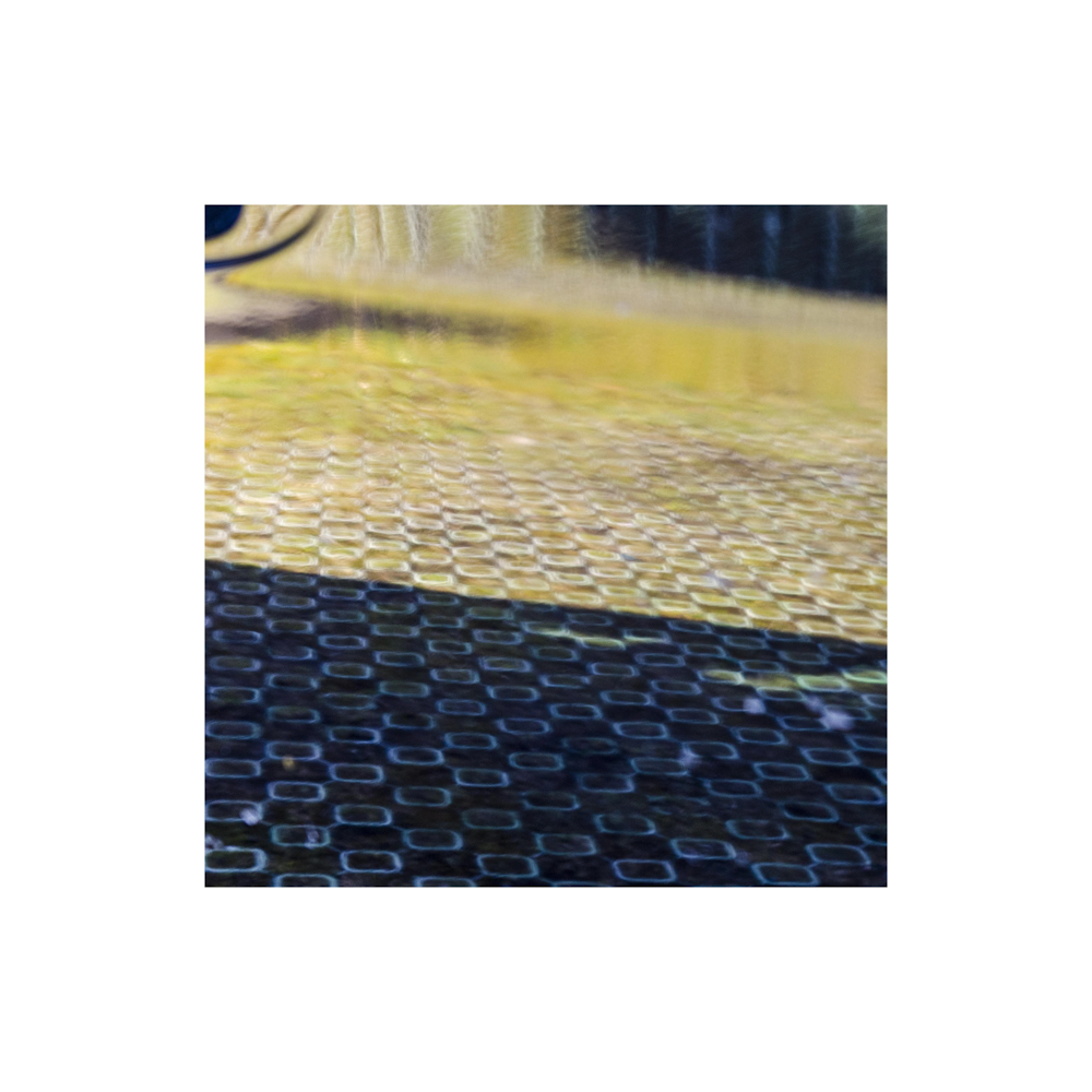
Pattern - Another good image that shows your good observation and
creativity. It makes a good interesting and well composed image. But consider
the brief - pattern... this supposes a repeating (probably single) pattern that
extends beyond the edges of the frame. In your image the main pattern is the
squares of the carport but thees are then dominated by the strong diagonal
midway up the frame and then further dissipated towards the top of the frame
by the other shapes/objects and colours.

I’m not saying your image is wrong or bad just alerting you to where your
pursuit of the theme is overwhelming the brief.

Friday, 5 April 2013

Part 3 - Colour - Exercise 1 - Strength of Colour


For this first exercise of this section 'Colour', I took a photography of an object of a definite colour and filled the frame with it. Firstly taking an averagely metered shot then a further 4 shots, 2 stopping half a stop down at a time then 2 stopping half a stop up at a time from the original.

The 5 images are shown below and my noted comments on the difference in colour of each are shown below the images.


f4 1/40sec
f4.5 1/40sec
f5.6 1/40sec
f6.3 1/40sec
f8 1/40sec
I took shots of a blue face cloth in soft light. The original average metered image was taken at f5.6 and I worked from there to get the other images. 
Apart from the obvious difference in exposure I feel the darker images have more strength than the brighter shots. There seems more intensity to the darker images whereas the brighter ones are weak and pale in comparison. There is a feeling of the colour being drained out of the brighter images, and unintentionally the fact this is a picture of a cloth it might be possible to imagine blue paint is being added to a white cloth and as more is added the more like the darker images it becomes. If the cloth was then to be rinsed out then as the paint runs out and leaves a weakly stained cloth the more like the brighter images it would become.
This is my answer and views of the differences of the colour in these shots.


Thursday, 28 March 2013

Assignment 2 - Elements of Design

This assignment is set to incorporate the insights I have learned so far in the course by showing a set of photos of a similar subject that will in turn show a given list of effects.

I decided to find a subject of my own and one I found interesting to photography but obviously allow me to fulfil the criteria of the assignment. My subject is called 'From Within' and is a series of views that I found by looking inwards to the paintwork of my car which in turn distorts and manipulates the everyday scenes we see as we drive around our environments.

This idea was inspired by a photobook I was given by someone returning from Italy one year, which was by an Italian photographer Andrea Michele Landini called 'Magic Trip'. It exhibits a set of photos of his local towns' scenery, streets and people through the reflections captured from his car, giving abstract interpretations which I found intriguing.

When taking the shots I learned each time the variations available dependant on my viewpoint and where I decided to focus. The waves of the paintwork lying just beneath the gloss finish gave a particularly intriguing effect to the images, giving the impression of an oil painting created by an artists paint brush. The distortion could also be used to assist in some of the criteria required for the assignment too. I was amazed at how many different views and perceptions could be found simply by moving around the car and changing my viewpoint or area of the car to look through. I found my favourite aperture was f4 which helped to narrow the depth of field to get my desired focal range, so not all, but the majority were shot this way.

Generally this was a subject that was fun to shoot but which hopefully produces interesting images for the viewer as well as fulfilling all the required criteria of the assignment.


Single Point Dominating the Composition

Postman's Dream
f8 1/13sec ISO 400
Here I found an old post box by the side of the road encased in an old sandstone wall. I placed the post box slightly off centre to bring some dynamism to an otherwise static picture. Positioning it on the left allowed the shadows of the trees to be explored, which also give a suggestion of some movement from their size and the texture from the paint.

Two Points

Choices
f4 1/125sec ISO 400

These two points come from one subject, the bridge. It was the distortion created by the reflection from the curved wheel arch, and moving ever so slightly that gave the illusion of two footbridges side by side. The precise points that stand out for me are the apex of the left hand bridge and the top structure angle of the right hand bridge. The right hand bridge is sharply cropped which gives a little sense of mystery to its destination. Strange perspective created in the left bridge gives the feeling of moving off into the distance and hence an uneasy dynamic. The manufactured stretch between the 2 points also manages to heighten the sense of choice required in choosing your path. 

Several Points in a Deliberate Shape

Picture Pain
f4 1/60sec ISO 400

An engraving shops advertising board was one of my shots for several points in a shape. I see many shapes made from the group of squares and rectangles but they maintain the same static feel. Structure and containment seem to be the general feel of the whole image with the large board holding the smaller frames within and unwilling to let the viewers eye wander from it. In the shade the image was also quite dull which in my opinion adds to the dull, mundane general feel to the whole image.

Signs of the Tree Lines
f4 1/800sec ISO 400

I decided to add this image because I liked the effect the shape created by the 3 signs and the tree had on the image. I felt that by being on the left it pushed the eye right, over the rest of the image opening it up from a small tight point to a wide open space until we look down the line of the gap of the door panel.

A Combination of Vertical & Horizontal Lines

Another Whole of the Wall
f4 1/100sec ISO 400

A simple shot of a brick wall perhaps, but I feel there is enough to engaged the viewer to look further than the structured vertical and horizontal lines of the mortar piecing the bricks together. The paint waves from the car create a blur that throughs up a question of motion which is a contrast in itself when we think of a static wall. The short diagonal shadows aid this and also help direct the viewer to the imperfection that is the hole from a decayed brick, just giving a little more to think about when viewing.

Diagonals

Window Washer
f4 1/200sec ISO 400

For a diagonal shot I started to look down onto my car which in turn looked up at surrounding buildings. This is a building used for student accommodation in Glasgow's city centre. It has striking horizontal and vertical lines but when viewed through my car bonnet become criss crossing diagonals giving the whole image a dynamic feel. I found myself looking along all the strong lines of colour which is only interrupted by the sharp sight of the cars screen wash nozzle which reminds my that this is being capture through the surface of the car. I also thought it could be suggested that the nozzle was to wash the windows of the building and not the cars windscreen.

Curves

U-Turn
f4 1/80sec ISO 400

This time I chose to use the natural features of the car to produce the effect, by the curve of the door handle. I very active shot which seems to throw the eye around the inner part of the handle in an anti clockwise direction, going round and round continuously even though the handle has been cropped and incomplete. The blur paint like diagonal waves above, heighten the strong effect of movement even though this shot was taken very much from a stationary position.

Distinct, Even if Irregular, Shapes

Narrow Lines
f4 1/400sec ISO 400

An every day road works sign was distorted in my cars front wing to create this distinctive but irregular shape. I find it containing and slightly uncomfortable to look at. The left hand point does try and send us into the rest of the image but the blurring gets us lost. The paint waves could possible suggest an artists abstract interpretation of what we know is a regular triangular sign due to its common sight on our roads. The dust spots again remind us that this image is captured through an unusual surface.

At Least Two Kinds of Implied Triangle

Catapult
f4 1/400sec ISO 400

By using the front wing of the car and moving my viewpoint, a straight telegraph pole was deformed into a strong triangular shape. The cars headlight echoes the shape and gives a particular bold line dissecting the two. The implied triangle from the pole which has only an apex appears to be getting pulled back, creating a tension that is about to be released like that of a catapult.

Flying High
f4.5 1/400sec ISO 400

The implied triangle here uses the sign post, its destroy double and the cars line of the door with the apex on the small area of the handle that is just in shot. I get the impression of the triangle sitting high above the car park below, almost like an aeroplane flying over head. The line on the lowest sign helps direct us back along to the door handle just to reinforce the triangle. The triangle gives a suggestion of motion, which makes it feel like the clouds are all moving in the direction of the handle.

Rhythm

Happiness
f8 1/160sec ISO 400

The rhythm of these evenly spaced trees was shot through the rear wing of my car. The eye going from tree to tree creates the rhythm and I also feel the large curve running around the bottom and sides gives a swinging feeling similar to a large smile of happiness which takes the eye back round to the start of the trees to begin the rhythmical journey again and again. Again I like the painting effect which with the low winter sun, rare blue sky in the back ground and soft yellows allows it to be imagined that this could be hanging on the wall of an artists gallery.

Pattern

Horizon
f4 1/100sec ISO 400

Here I have chosen a reflection that shows all three depths of field found when using a cars paint work as a medium. At the front is the sharp structured squares of a carport's surface, then the distinct diagonal shadow separates and opens up the softer less structured surface which has the effects of blurring from the aperture setting. From here we begin to get the paint waves that create the dreamy artists painting feel until we reach the unstable, zany distortion and abstract produced from the curves and lines of the cars surface. There is an obvious pattern and with the sharp shadow line cutting diagonally across it gives a very graphic feel to it. I felt this to be an ideal image to finish on, one that shows all the areas explored around my car as I created this series of photographs.
 

Conclusion

Overall I found this section a real learning curve. There are things in a photograph that I liked before but never truly understood why and similarly when I took a photograph I pressed the shutter when it felt right, so possibly some elements of design come naturally and are setup subconsciously. Now with a little more insight into the effects of different points, lines and shapes in different positions in the frame and to each other I feel I have found myself looking out for shapes and implied lines etc in everyday views and even more so when I set up a specific shot. Basically I feel I have more knowledge than before and when required in creating an image I will think about what I aim to achieve and try my best to use these elements to portray this to the viewer. I believe it will take time to make this a conscious part of my image making but by continuing to take more and more photographs I hopefully can only improve and get my desired message across in my photography.
So as I hoped this is the reason I started this course, it may take me longer than I wish to get through due to my commitments elsewhere but if I gain a little knowledge about something I love to do then it is a screaming success and I look forward to the next section of this module.


Saturday, 16 March 2013

Part 2 - Elements of Design - Exercise 8 - Rhythm and Pattern

The final exercise in Part 2 was Rhythm & Patterns, where I had to produce 2 photography one conveying rhythm and the other a pattern.


Rhythm
For rhythm I shot a large pebble by the shore of a river when the water was low. I used a shallow depth of field to concentrate the initial focus on the stone and let the eye travel across the sand to the rhythmical beat of the absent flowing water that has left the rolling waves of sand. I decided on a tight square crop to contain the feeling of motion and not fade out of the image, instead allowing the eye to bounce off the edge of the frame and travel back across the mini sand dunes.


Pattern
This image was taken of a pile of old railway bolts. I found the colours and the random directions created an interesting pattern when cropped tightly to show no edges to the pile. I was aware that strictly speaking pattern should be spatial repetition and this image is possibly too random in the spatiality of the bolts and sending the eye in lots of different directions. Although I felt that with the tight crop and no boundaries I can still be that the eye imagines them continuing well beyond it.

Pattern 2
Pattern 2 has been added to give an example of a more traditional pattern with these bolts on the side of a rail wagon where with low sunlight have long low shadows to give a more 3 dimensional feel to the bolts. The strong horizontal and vertical lines made by the bolt heads cement a static feeling, but with the even spaces between them and the tight crop it can be imagined that out with the boundaries of the frame they will continue to produce this static pattern.


Friday, 15 March 2013

Part 2 - Elements of Design - Exercise 6 - Implied Lines

First up for this exercise was to looking at the following 2 photographs and if a dominant implied line of direction was found then mark it with an arrow.

Corrida by Michael Freeman
This image by Michael Freeman captures the graceful movement of a Matador and Bull. I found that there was a strong line of direction clockwise around the Matador which the bull is going in. This notion is heightened by the red circular line in the dirt and the whole picture gives us a feeling of spinning almost like a tornado around the Matador.

Threshing Corn in Sicily by Gotthard Schuh

Gotthard Schuhs' image again captures great elegant movement of the 2 horses as they trot around their trainer. There is a definite circular motion going anti clockwise around the man where with the horses heads pointing in the same direction only reinforces this. There seems to be less strong implied lines between the man and the horses along the rope connecting them and the eye line of the man. These lines seem to give a feeling of togetherness joining the 3 into one graceful movement. I also feel I can imagine the up and down motion of the horses trot perhaps due to there stride seemingly being captured in unison.

The second part of the exercise was to choose any 3 photographs and perform the same analysis as with the first 2.

Image 1

Image 1 was taken on a cold winters afternoon with a kite surfer braving the conditions. Generally we have the horizontals of the horizon and the sea waves with very little happening above the horizon. There is some directional lines along the waves suggesting the surfers direction of travel is from left to right. But with the physical line between the surfer and his kite we get a stronger implied line which allows us to drift our eye up from the sea and into the grey mirky sky and onto the kite, bringing more of the image together.

Image 2

Here in image 2, we get the strong implied line from the subjects eyes to the writing on the sand. Her direction of travel also gives a sense of movement around the heart shape instead of just standing looking at it. There is also a line along the beach/grass line that leads us to the subjects eyes that we subsequently travel down her eye line to the sand with an almost zig zag effect.

Image 3

In image 3 we have 3 subjects, initially we have the young girl walking alone the line of her shadow with arms out, giving the implied line out of the image. We also get a sense of movement from the 2 ladies on the left, with the wind obviously blowing their hair and dresses from behind there is almost a feeling they are unable to resist its strength and are being blown out the shot from right to left, the opposite of the your girls direction of travel. The complete image gives me the impression of someone putting their hands into the centre of the image and parting them outwards, trying to wipe the 3 subjects from the shot.

The 3rd part of this exercise is to take 2 photographs planning implied lines to lead the eye using firstly, eye line then the extension of a line or lines that point.


Image 4 - Eye-line
Image 4 was my attempt to capture an image that used implied eye-lines to lead the eye. These faces hang in one of the huge rooms of the Kelvingrove Museum, Glasgow and I used their totally random direction to create an almost haphazard image where the eye is lead in all different directions around the many faces to a point of almost confusion. Possibly not the most stable image but for this exercise I thought it would highlight the impact of implied eye-lines as tools to direct and lead the eye. I cropped to a square to try and highlight the confusion where as with the original portrait crop I found there was an opportunity for the eye to escape from the madness that was intended.


Image 5 - Extension of a line, a line that points
Here in image 5, I was messing around with depth of field, moving my focal point with the aperture wide open to see what I got as I looked along some barbed wire. I noticed that by moving my viewpoint and focusing in on this certain piece of wire I could use the top point of the 3 strands around the wire to point the eye down the line of the wire and into the blurred abyss created by the shallow depth of field. This time I used the portrait crop to help emphasise the nothingness that lay along the wire.

It was enlightening to realise the importance of implied lines when working through this exercise. Again this might have been an unconscious decision when framing an image before hand but now hope to put more thought into my design of a shot and where I want to direct the viewer and hold their attention in a certain part of the image. And it has also helped me understand why some images grab my attention and give a certain feeling or mood when being explored.

Friday, 8 March 2013

Part 2 - Elements of Design - Exercise 5 - Curves

This exercise was similar to diagonals, where I had to go out and take 4 image thats use curves to emphasise movement and direction.

Image 1
My first image was taken of a hand railing overlooking a river. The strong curve takes our eye around the image in a shallow loop starting at the front. I used a shallow depth of field to continue with the flatness and keep the start point of the eyes journey sharp giving no alternate to the viewer but to start at the front and work around the rail.

Image 2

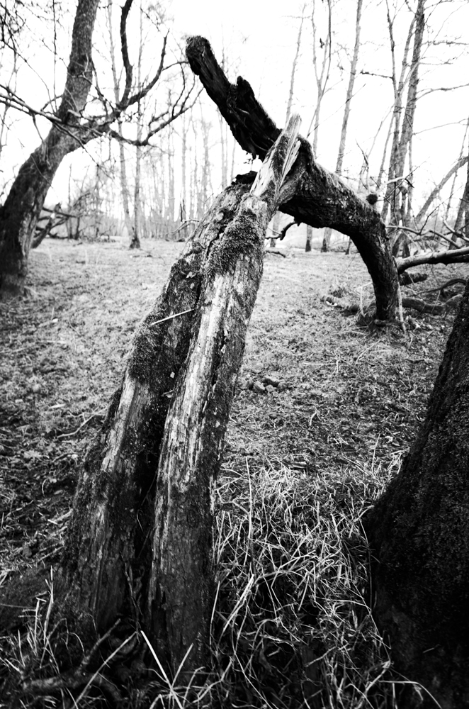
In image 2 I was in a very tranquil wooded area and wondered how I could bring some suggestion of movement and direction to a shot. When I found this strangely bent tree I adjusted my view point and used a wide angle lens at 14mm to accentuate the natural curve and create the feeling of movement along and round its shape, bringing some life to an otherwise dormant, still location.

Image 3

Image 3 was taken in a shopping wall I had photographed before and new there was the winding staircase. I selected a section to shoot and tried to use both rails to portray some smoothness and grace as they climbed up the curvature of the stairs themselves. The twist in the stairs also gives me a feeling of the eye being pushed across from the right rail the left as we come to the top of the stairs then almost bringing the eye back down again.

Image 4

With image 4 I used a modern footbridge across the river Clyde in Glasgow, facing the financial district of the city. Here we have the very strong curves of the bridge winding and twisting across the shot from left to right. The rail also adds to the sense of movement and helps direct the eye across the bridge as with its perspective it points us in that direction. By moving my viewpoint and getting lower than eye level I managed to get the far end of the bridge tuck under itself and complete the full journey across, whereas with other attempts in a higher viewpoint this was hidden by itself and left it looking as if it stopped midway across.

This exercise along with the previous 3 had me looking at things I had always looked at and see more of them. These curved, horizontal, vertical and diagonal lines were always there but it is only after examining them and looking out for them that I realise their effect and emphasis on an image are huge. Possibly this was a subconscious part of my photography before but now having the conscious understanding of their importance I hope to try and produce more interesting images that I have deliberately designed to be viewed in a desired may, that is appealing to the viewer.


Thursday, 7 March 2013

Part 2 - Elements of Design - Exercise 4 - Diagonals

In this exercise I had to take 4 photographs that use diagonals strongly.
With only a few real diagonals available, viewpoint and perspective can be used to create diagonals.

Image 1

Here in image 1 I found some real diagonals, unsurprisingly being stairs. There is not one simple diagonal in this shot but 4 with 1 being in a complete opposite direction to the other 3. In this setup I find that the stairs create movement within the image, taking the eye up and around the image as we natural walk our eyes along the stairs from ground up. I converted to B&W to highlight the linear nature of the stairs.

Image 2

In image 2 I used a natural slope and shadow of a mountain when visiting the Cairngorms. I used a square crop, the horizontal of the horizon and vertical of the post to emphasise the dissecting nature of the diagonal which cuts through the clouds and takes our eye down along the slope. Again this is more of a real diagonal rather than one created by viewpoint or perspective and suggest a feeling of speed as we imagine traveling done the slope. I kept the blues prominent to emphasise the cold and the clearness of the sky.


Image 3
For image 3 I used perspective and viewpoint to create the the strong diagonals of the straight path that leads to an derelict bowling club in Glasgow's South side. By going down low and centring my position I manage to create 2 strong diagonals that draw the eye in towards the boarded up buildings. The converging lines are very useful to direct the viewer into this picture. The B&W conversion was used to continue the feeling on dilapidation. 

Image 4

Image 4 used perspective to create the strong diagonal. This is a footbridge across the river Clyde and there is a real feeling of movement as the diagonal line of the barrier and shadows takes us across the bridge an into the buildings on the other side. The diagonal of the suspension support also takes us to the same point converging with the lines of barrier. 


Concluding, I found diagonals are very useful in creating an image and instrumental in directing the viewer as well as giving the feeling of movement or direction. The fact that they can also be easily created by changing viewpoint or focal length means they are something that should always be in a photographers mind when composing an image.